When you think of iconic brands—Coca-Cola, McDonald’s, or Apple—one of the first things that comes to mind is their colour. Colour isn’t just a visual detail; it’s a critical part of how customers perceive and remember a brand. Whether you’re designing a logo, launching a product, or crafting a digital experience, your colour choices can make or break your marketing efforts.
In this blog, we’ll explore the importance of colour in branding and marketing, and how you can use it strategically to strengthen your message, connect with your audience, and drive engagement.
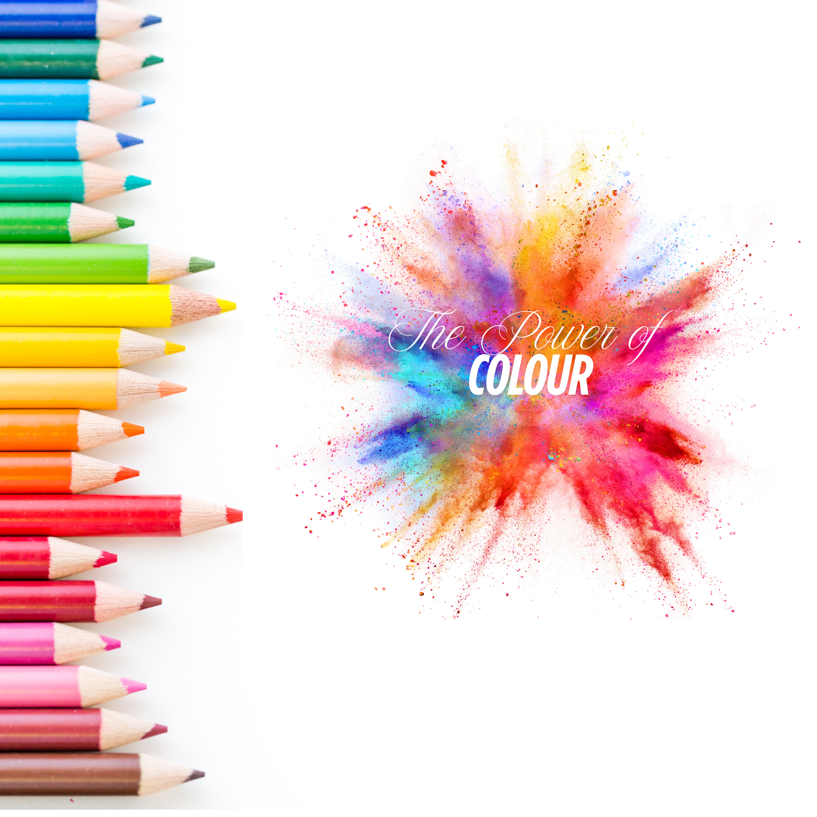
1. Colour Influences First Impressions
Studies show that people make subconscious judgments about a product within 90 seconds of viewing it—and up to 90% of that assessment is based on colour alone. In a world flooded with content and brands vying for attention, colour can give you the edge by capturing attention quickly and creating an immediate emotional impact.
Red evokes energy, passion, and urgency (often used in clearance sales).
Blue conveys trust, security, and professionalism (popular in tech and finance).
Green suggests growth, health, and eco-friendliness.
Yellow communicates optimism and warmth.
Black symbolises luxury and sophistication.
Purple hints at creativity, wisdom, or wealth.
2. Colour Enhances Brand Recognition
Consistent use of colour increases brand recognition by up to 80%. Think of the golden arches of McDonald’s or the Tiffany blue box—these colours are inseparable from the brand identity.
Creating a brand colour palette helps ensure uniformity across all touchpoints: your website, packaging, social media, and advertising. This consistency builds familiarity and trust over time, which is essential for customer loyalty.
3. Colour Connects with Emotions and Psychology
Colour psychology plays a significant role in consumer behaviour. Different hues can evoke different feelings and influence how people perceive your brand’s personality. For example:
-
A wellness brand might lean into soft greens and neutrals to suggest calmness and purity.
-
A youth-focused fashion brand might use vibrant pinks or electric blues to feel fun and fresh.
-
A luxury car brand might choose dark greys, silver, and black to convey elegance and performance.
Understanding your target audience’s preferences, cultural background, and emotional triggers can help you choose colours that resonate on a deeper level.
4. Colour Guides Consumer Action
Beyond emotion, colour also plays a role in conversion. Certain colours can influence click-through rates, purchase decisions, and engagement. For instance:
-
Call-to-action (CTA) buttons often use high-contrast colours like orange or red to stand out.
-
E-commerce platforms might use green to signal “go” or success at checkout.
-
Limited-time offers might use urgent reds or oranges to create FOMO (fear of missing out).
The key is balance—your colour should grab attention without clashing with your overall brand aesthetic.
5. Colour Matters Across Cultures
It’s important to recognise that colours don’t mean the same thing everywhere. While white symbolises purity in Western cultures, it can represent mourning in some Eastern traditions. Red might symbolise luck in China, but danger or warning in other parts of the world.
If your brand is global or plans to scale, you’ll want to research colour meanings in different regions to avoid unintended messages or offence.
Tips for Choosing the Right Colours for Your Brand
-
Start with your brand values. What do you want people to feel when they interact with you?
-
Know your audience. What colours resonate with your demographic?
-
Study your competitors. Stand out, but also understand your industry’s visual language.
-
Test and refine. Use A/B testing to see how different colour schemes impact engagement or conversions.
Conclusion: Colour is More Than a Design Choice
Your brand’s colour palette is a communication tool. It tells your story, defines your tone, and influences perception—all before a single word is read. When used wisely, colour becomes a strategic asset that can amplify your brand, boost marketing performance, and create lasting emotional connections.
So, next time you’re picking a colour for your logo or campaign, don’t just go with your favourite hue—choose with purpose.
Need help defining your brand colours or visual identity? Reach out to the Invincipeople team and let’s craft a colour story that sticks.